Make Your Online Events More Disability Friendly
Events, seminars and lectures, medical visits, movies, all from your computer?
Online teleconferences have become a staple for many lives personally and professionally, and it’s essential they are accessible to as many people as possible, including those with disabilities and those who may be staying at home or otherwise unable to attend in-person.
To some people, the option of attending a video event rather than an in-person one is accessible enough, but for others—especially if you’re, let’s say, hosting a multi-day conference with hours of programming—almost no one will have their eyeballs glued to the screen for that long (not to mention the risks to your visual health).
Read on for some more tips and ideas to make your online groups, visits, and events more disability friendly.
Take Frequent Breaks
Depending on the person, people need time to eat, drink, stretch, move, use the washroom, manage mensturation, incontinence, or pregnancy, take medications, refill bottles/mugs, have a smoke break—and if they’re tuning into your event from home, could include all that and more.
As a general rule of thumb, an example of frequent breaks are: 10 minute break per hour, 15 minutes every 1.5 hours, or 20 to 30 minutes every 2 hours. You could also plan for a full hour’s lunch break.
This helps not only to digest what’s been said in an event, but to facilitate people who need breaks without feeling like they must draw attention to you or themselves by asking for one.
Because access needs can vary, a 5 minute break might be enough for one person but not another (eg. perhaps someone needs extra time using the stairs or an electric lift to reach the bathroom in their home), which is why we suggest 10 minutes to be a minimum break length.
Whatever you end up going for in your event, make sure they occur at a reasonable time, at a reasonable length, and do not put the burden on individual participants to ask, or compel people to miss out.
Colours, Font, and Pictures
If your event involves a presentation or sharing your likeness, think about the colours you are using in your event materials.
It can be easy to fall into making slideshows and other presentations in eye-catching colours and trendy fonts, and doing so can create a presentation that is aesthetically pleasing—but not accessible. Keep these things in mind:
Make your colors contrast enough so that those with low vision can see the content.
Avoid colors that are too garish or outlandish (eg. Heavy neon yellows and oranges)
Avoid overloading slides with mountains of text, or have too much text that cannot be read in a short period of time.
Give enough time for audiences tor read your slides/event materials. Make timely pauses if you are presenting so that people can catch up with reading and processing your points.
Let People Be Off-Camera
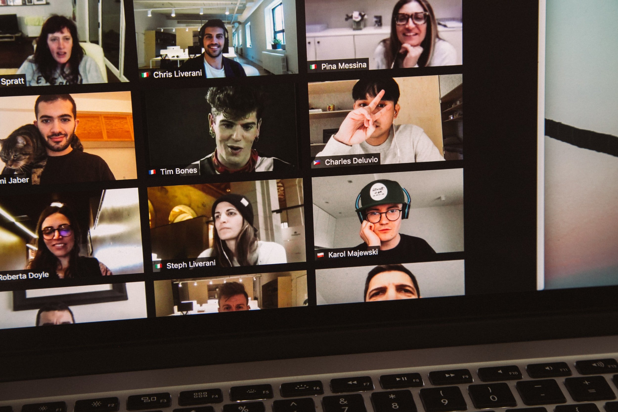
“Zoom Fatigue” is term that emerged in 2020, as the COVID-19 pandemic resulted in an immense increase and demand of videoconference meetings among various levels of academic, professional, and personal users.
Zoom Fatigue, generally speaking, is physical, mental, emotional, and social fatigue resulting from prolonged engagement in videoconferencing, especially if you are using excessive amounts of eye contact, noticing and monitoring your own face and others, not giving your eye muscles time to stretch and look elsewhere, and the cognitive load of managing one or more channels of information (eg. participants, presentation) going on at the same time.
The need to be constantly present on camera, the lack of physical cues in virtual communication, and the constant screen time can lead to, decreased productivity, increased stress, and increased instances of headaches, eye strain, and migraines.
Taking breaks, as suggested earlier, can help decrease the cognitive load of online events, but to make things even more reliving, reduce or make optional the requirement to have everyone’s cameras turned on.
Offer Multiple Ways to Access The Event
In-person, online, and recorded for review after the event are standard for most online presentations and events.
Powerpoints, Canva videos, Zoom videos and more offer the functionality to record your presentation and yourself for you to create a copy of your presentation that you can view and share with others at a later time.
Another option is to split your presentation into smaller seminars, and to present at different times of day to accomodate different time zones.
Provide Text Transcript and/or Closed Captioning
If you are allowing your content to be viewed online indefinitely (eg. Youtube), then clear, legible subtitles will go a long way rather than relying on autogenerated subtitles, or none at all.
At Qi Creative, we use Kapwing when creating subtitles for longer-form videos. It is an easy to use interface where all you let autodetection build most of the subtitles, then adjust for spelling mistakes, timing, size, background, and you’re good to go!
Don’t have time to do it yourself? Many organizations rely on freelance transcribers and video editors who can add subtitles to all their visual content.
Making online presentations accessible to people with disabilities is essential to ensure that everyone can participate and benefit from what you have to present, and that what you have to share can be shared with as many people as possible.
By following these tips, you can make your online presentations more accommodating for people of all sorts of needs, whether they be of access, disability, or the complex messiness of human life and remote work today.
More Resources
Working safely with display screen equipment - Health and Safety Executive
Nonverbal Overload: A Theoretical Argument for the Causes of Zoom Fatigue
Zoom Fatigue and simple fixes - Stanford News
Creating Accessible Powerpoint Presentations - disbilityawareness.training
Accessibility in Presentations: Making your Slides Accessible - Slide Model


